In the vibrant city of Designopolis, where aesthetics and functionality blend seamlessly like colors on a canvas, there thrived a guild of artists and engineers known as the Crafters of Userland. This skilled collective was renowned throughout the digital realms for their ability to sculpt experiences that delighted the senses and eased the journey of the user through the vast cyberspaces.
Our tale centers on a young Crafter named Taylor, who, with a keen eye for beauty and a masterful grasp of code, embarked on a quest to create a new interface—a portal that would welcome users from far and wide, guiding them with light and clarity on their digital quest. Taylor poured heart and soul into the design, envisioning a layout of harmonious proportions, elegant typography, and a palette that whispered of dawn's first light.
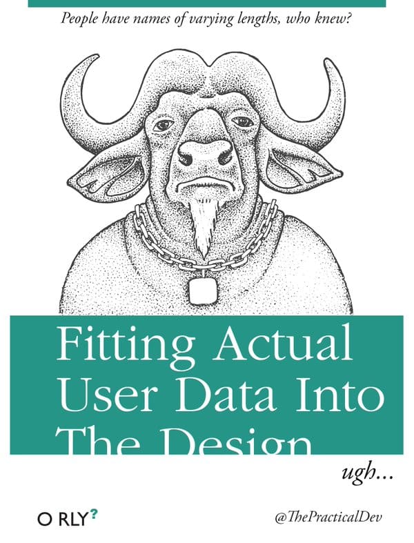
But as the portal neared completion, a challenge unforeseen rose to the surface, a riddle that threatened to unravel the fabric of Taylor's creation: the integration of Actual User Data. "People have names of varying lengths, who knew?" Taylor mused, a note of irony in their voice, as they faced the reality that the beautifully uniform placeholders of "John Doe" and "Jane Smith" bore little resemblance to the diversity and complexity of real user names.
From the succinct "Li" to the majestic "Alexander Hamilton-Churchill", the user data spanned a spectrum that defied the constraints of Taylor's carefully laid design. Names overflowed their containers like rivers breaching their banks, breaking the harmony of alignment and challenging the very foundations of the layout.
With the launch date looming like a storm on the horizon, Taylor dove back into the fray, armed with the tools of their trade: Javascript, HTML, CSS. The Crafters of Userland rallied to Taylor's side, for the quest was not Taylor's alone but a trial that spoke to the heart of Userland's ethos.
The guild labored by day and by night, weaving new spells of responsive design and dynamic scaling. CSS Grids and Flexbox became their swords, cutting through the chaos; Media Queries, their shields, guarding against the unpredictability of the data. Javascript lent its might, transforming static elements into fluid containers that grew and shrank with the ebb and flow of user information.
As the final lines of code were inscribed and the last pixels placed with precision, Taylor and the Crafters of Userland stepped back to behold their creation. The portal, now reborn, was a testament to their resolve, a place where every name found its home, cradled in the balance between design and data.
The day of the launch dawned clear and bright, and as users from across the digital realms entered the portal, their names—each unique, each a story unto itself—flowed seamlessly within the fabric of the interface. The Crafters of Userland watched with bated breath, but as the hours passed, it became clear that their efforts had borne fruit. The portal stood strong, a beacon of inclusivity and adaptability.
And so, the tale of "Fitting Actual User Data Into The Design" was woven into the tapestry of Designopolis, a reminder to all who craft in the realms of UX and UI that the true measure of a design lies not in its beauty alone but in its ability to embrace the diversity of the human experience. Taylor's journey taught them that in the dance between form and function, there is a place for every name, every story, and that the art of design is, at its heart, an act of understanding and accommodation.