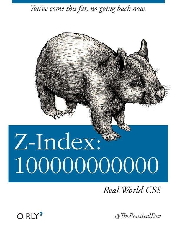
In the bustling metropolis of Webville, a city built on the ever-shifting sands of HTML and styled by the winds of CSS, there exists a towering skyscraper known as Z-Index Tower. This colossal structure, stretching far into the clouds of the digital skyline, is a monument to the developers' endless quest for visibility and prominence in the crowded landscape of the internet.
Our story follows the journey of a daring developer, Casey, known throughout Webville for their fearless approach to frontend development and their penchant for pushing the boundaries of CSS. Casey had embarked on a quest to construct the most visually stunning website Webville had ever seen, a site that would stand out amidst the cacophony of the internet like a beacon of design and innovation.
As Casey laid the foundations of their masterpiece, utilizing the finest HTML and crafting exquisite layouts, they encountered a challenge that would test the very limits of their skills: the battle for visual hierarchy. With elements clamoring for attention, competing modals, and dropdowns threatening to overshadow the content, Casey knew that only the judicious use of Z-Index Tower could bring order to the chaos.
With a resolve as strong as flexbox and a spirit as bold as the boldest font, Casey began to scale Z-Index Tower, invoking the power of z-index: 100000000000. Each increase in the z-index was a step upwards, a bold assertion of priority in the visual landscape, ensuring that the most critical elements soared high above the rest, unobstructed and supreme.
But as Casey ascended, they realized the peril of their journey. The higher they climbed, the more precarious their position became. The Tower, built on numbers as large and unwieldy as the ambitions that fueled its creation, was a fragile edifice. Each addition to the z-index, while elevating an element, threatened to unbalance the whole, creating a dizzying maze of overlapping layers that defied logic and order.
It was then, perched high above the city of Webville, that Casey had their epiphany. "Real World CSS | You've come this far, no going back now," they muttered to themselves, a mantra of determination and a recognition of the journey's point of no return. To achieve the harmony and visual clarity they sought, Casey realized, required not just the brute force of z-index escalation but a careful, considered approach to stacking context and element hierarchy.
With renewed purpose, Casey descended Z-Index Tower, their descent a metaphorical rolling back of the excessive z-index values. They restructured their code, employing advanced CSS techniques such as flexbox and grid, positioning and opacity, to create depth and emphasis without reliance on the Tower's precarious heights.
The result was a website that shone like a jewel in Webville, a testament to the power of restraint and the beauty of well-structured CSS. Casey's journey up and down Z-Index Tower became the stuff of legend, a cautionary tale and a source of inspiration for developers across Webville.
And so, the saga of "Z-Index: 100000000000" serves as a parable for the modern web developer, a reminder that in the quest for visual prominence, the truest path to clarity and impact lies not in the extremes of z-index but in the thoughtful composition of elements and the masterful application of CSS. In this balance, Casey found not just the solution to their quest but a deeper understanding of the art of frontend development itself.